


Hey guys! Today’s post is on how to design different types of infographics for different audiences.
Why design and layout matter.
The main objective of having an infographic is to make information more compact, meaningful, easily digestible, and memorable for your audiences. It would be such a pity if a sub-par layout dilutes your message and points!
Ensure that there is ample spacing in your infographic and that it is designed with a well-arranged layout. This is so that the infographic can be attractive for your reader to read–take note of the usage and number of colours and typography as well.
What type of infographic is considered “well-arranged” and “well-thought-out”? Let’s find out!
The 7 different types of designs for infographics.
Layout #1: The really practical design
How this layout looks like:

(Source: MGIC)
This infographic is designed to be practical, and hence it is most useful when you want to convey a message to the masses/ consumers. It functions like a one-pager which your audience can conveniently print out to refer to from time to time. You can see from the above that relevant and interesting facts about credit scores are laid out clearly.
Layout #2: The comparison infographic
How this layout looks like:

(Source: Venngage)
This infographic is designed to compare A to B. Dividers and colours are used to split A apart from B, with point-to-point comparisons. This type of layout works best when there are a lot of bullet points used in the comparison topics. This type of infographics might be most useful to students, consumers, and maybe even practitioners in a given industry.
Layout #3. The Timeline.
How it looks like:

(Source: 7428)
This type of layout is best when you want to communicate history or a chronological series of happenings and events to your audience. This might suit a crowd from industry or research. Of course, if you are a teacher, it will also be great to use such infographics to communicate the series of happenings to your students.
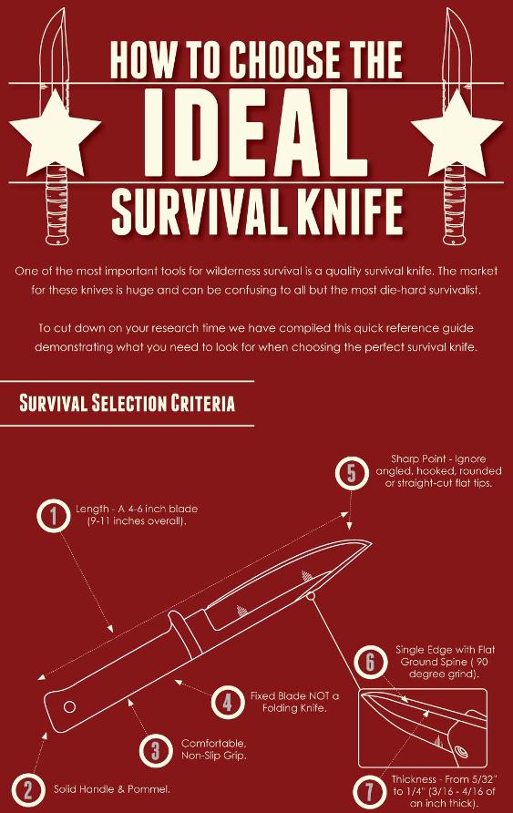
Layout #4: The “How to” infographic
How it looks like:

(Source)
“How-to” infographics rely heavily on images and numbers that are clearly written out. Plan your layout such that attention is immediately focused on the main topic of your infographic–in this case, the reader’s attention is immediately drawn to the knife. Also, make sure that your infographic is not to overloaded with numbers and images–lest it gets confusing! Keep the colour palette as simple as possible as well. A “How-to” infographic is great for the consumer crowd.
Layout #5: The Heavy Data Infographic.
How it looks like:

(Source)
This sort of layout involves a lot of data, and visually speaking, this means a lot of circles. It is possible to make various flowcharts and/or bar charts to show the relationships between the circles. You can also separate the infographic by the type of charts you have on it. This type of infographic layout is particularly good when communicating with audiences in industry or research.
Layout #6: “Location” type of infographic.
How it looks like:

(Source)
For infographics that are based on geography and location, usually, there is a visual map of the place featured. Layout wise, attention would be drawn first to the map, and then to how the map is divided. Usually, there would also be the description bar on the sides or at the bottom.
Layout #7: The “Process” type of infographic.
How it looks like:

This type of infographic conveys a flow. It shows how a process or story develops. Because you want to tell the story of a flow, it might be a wise idea to use diagrams sparingly. The attention can ideally be on how one event precedes the other. This type of infographic is relevant to researchers, students, consumers, and practitioners. Everyone loves a good story, and it is always helpful to be able to visualise how things progress!
Is there anything else I should note?
Remember to always keep the infographics simple and easy on the eyes! An infographic is meant to simplify, not to overwhelm.
We hope you have enjoyed today’s post on infographics, design, and layouts! Have a good Friday ahead.


